Subscribe to Newsletter and get 15% Discount
On your next purchase
On your next purchase
On your next purchase
Please enter your Email Address. You will receive a link to create a new password via Email.
Search Results:
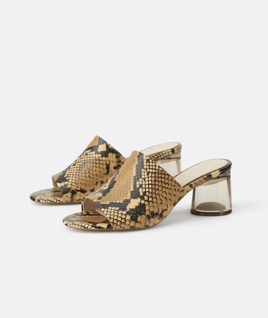
Leather mid-heel Sandals
$129.00
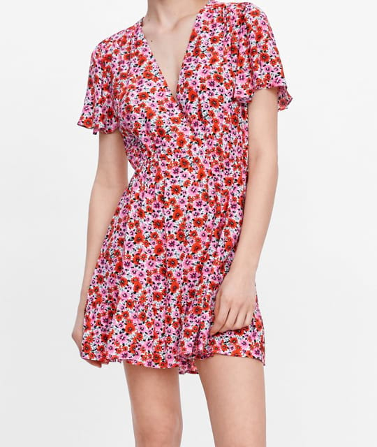
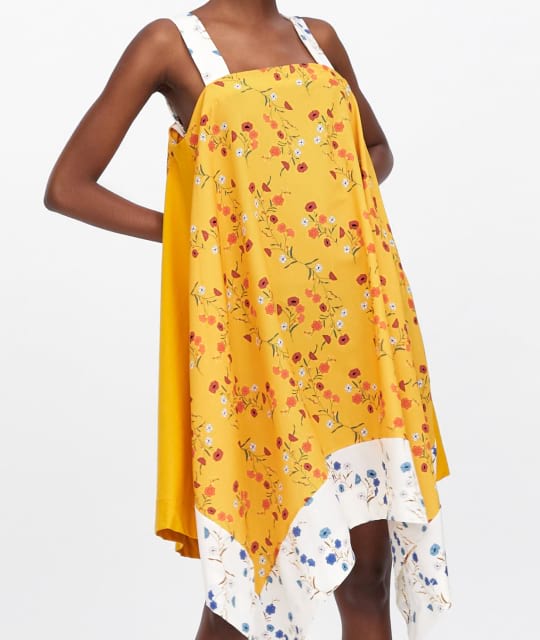
Cotton floral print Dress
$40.00
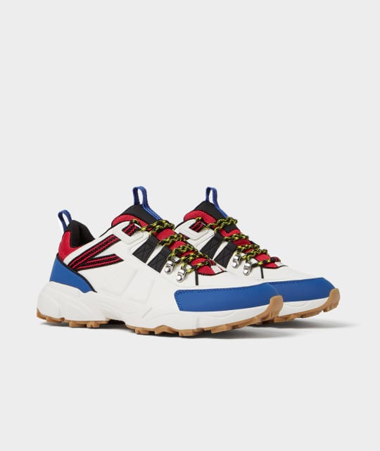
Leather Sneakers
$85.00
Cropped cotton Top
$29.00
Floral print midi Dress
$50.00
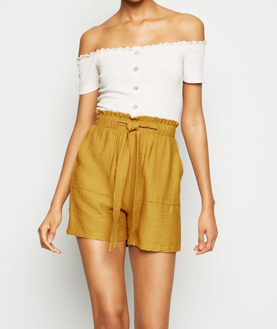
Nothing matches your search
😞
Cotton floral print Dress
$40.00
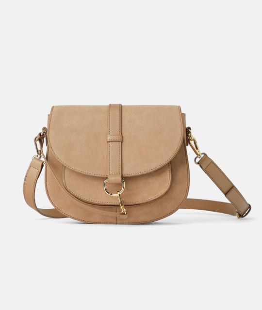
Suede cross body Bag
$49.00
| Size | US | Bust | Waist | Hips |
|---|---|---|---|---|
| XS | 2 | 32 | 24 - 25 | 33 - 34 |
| S | 4 | 34 - 35 | 26 - 27 | 35 - 26 |
| M | 6 | 36 - 37 | 28 - 29 | 38 - 40 |
| L | 8 | 38 - 29 | 30 - 31 | 42 - 44 |
| XL | 10 | 40 - 41 | 32 - 33 | 45 - 47 |
| XXL | 12 | 42 - 43 | 34 - 35 | 48 - 50 |
| Size | US | Foot Length |
|---|---|---|
| 36 | 5 | 22.8 |
| 26.5 | 5.5 | 23.1 |
| 37 | 6 | 23.5 |
| 37.5 | 6. | 23.5 |
| 38 | 7 | 24.1 |
| 38.5 | 7.5 | 24.5 |
| Size | US | Foot Length |
|---|---|---|
| 36 | 5 | 22.8 |
| 39 | 8 | 24.1 |
| 40 | 9 | 25.4 |
| 40.5 | 9.5 | 25.7 |
| 41 | 10 | 26.0 |
Justo ut diam erat hendrerit morbi porttitor, per eu curabitur diam sociis.
Use Bootstrap’s custom button styles for actions in forms, dialogs, and more with support for multiple sizes, states, and more.
Bootstrap documentation
In need of a button, but not the hefty background colors they bring? Replace the default modifier classes with the .btn-outline-* ones to remove all background images and colors on any button. Additionally we've added the .btn-outline-border modifier.
                  <button type="button" class="btn btn-outline-primary">Primary</button>
<button type="button" class="btn btn-outline-secondary">Secondary</button>
<button type="button" class="btn btn-outline-success">Success</button>
<button type="button" class="btn btn-outline-danger">Danger</button>
<button type="button" class="btn btn-outline-warning">Warning</button>
<button type="button" class="btn btn-outline-info">Info</button>
<button type="button" class="btn btn-outline-border">Border</button>
Besides .btn-lg and .btn-sm, we've added .btn-xs and .btn-xxs for even smaller buttons.
                  <button type="button" class="btn btn-primary btn-lg">Large button</button>
<button type="button" class="btn btn-secondary">Basic button</button>
<button type="button" class="btn btn-success btn-sm">Small button</button>
<button type="button" class="btn btn-danger btn-xs">Extra small button</button>
<button type="button" class="btn btn-warning btn-xxs">XXS button</button>
Turn any button into a circle with a .btn-rounded-cirle modifier.
                  <button class="btn btn-primary btn-circle btn-lg mb-1">
  <i class="fe fe-check"></i>
</button>

<button class="btn btn-secondary btn-circle mb-1">
  <i class="fe fe-check"></i>
</button>

<button class="btn btn-success btn-circle btn-sm mb-1">
  <i class="fe fe-check"></i>
</button>

<button class="btn btn-danger btn-circle btn-xs mb-1">
  <i class="fe fe-check"></i>
</button>

<button class="btn btn-warning btn-circle btn-xxs mb-1">
  <i class="fe fe-check"></i>
</button>
Remove top, right, and left borders with a .btn-underline modifier.
                  <button class="btn btn-outline-primary btn-underline mb-1">
  Primary
</button>

<button class="btn btn-outline-secondary btn-underline mb-1">
  Secodary
</button>

<button class="btn btn-outline-success btn-underline mb-1">
  Success
</button>

<button class="btn btn-outline-danger btn-underline mb-1">
  Danger
</button>

<button class="btn btn-outline-warning btn-underline mb-1">
  Warning
</button>

<button class="btn btn-outline-dark btn-underline mb-1">
  Dark
</button>

<button class="btn btn-outline-border btn-underline mb-1">
  Border
</button>
Simply add the Feather Icons left or right arrow icons to animate them on hover.
                  <button class="btn btn-dark mb-1">
  Next Step <i class="fe fe-arrow-right ms-2"></i>
</button>

<button class="btn btn-outline-border mb-1">
  <i class="fe fe-arrow-left me-2"></i> Previous Step
</button>
Popular brand colored buttons. Easily add more by extending the $brand-colors SCSS map in variables.scss.
                  <button class="btn btn-facebook mb-1">
  Facebook
</button>

<button class="btn btn-twitter mb-1">
  Twitter
</button>

<button class="btn btn-pinterest mb-1">
  Pinterest
</button>

<button class="btn btn-linkedin mb-1">
  LinkedIn
</button>
Creates a pulse effect on hover. Works perfectly with circle buttons.
                  <button class="btn btn-lg btn-circle btn-hover btn-primary mb-1">
  <i class="fe fe-heart"></i>
</button>

<button class="btn btn-circle btn-hover btn-secondary mb-1">
  <i class="fe fe-heart"></i>
</button>

<button class="btn btn-sm btn-circle btn-hover btn-success mb-1">
  <i class="fe fe-heart"></i>
</button>

<button class="btn btn-xs btn-circle btn-hover btn-warning mb-1">
  <i class="fe fe-heart"></i>
</button>

<button class="btn btn-xxs btn-circle btn-hover btn-info mb-1">
  <i class="fe fe-heart"></i>
</button>