Subscribe to Newsletter and get 15% Discount
On your next purchase
On your next purchase
On your next purchase
Please enter your Email Address. You will receive a link to create a new password via Email.
Search Results:
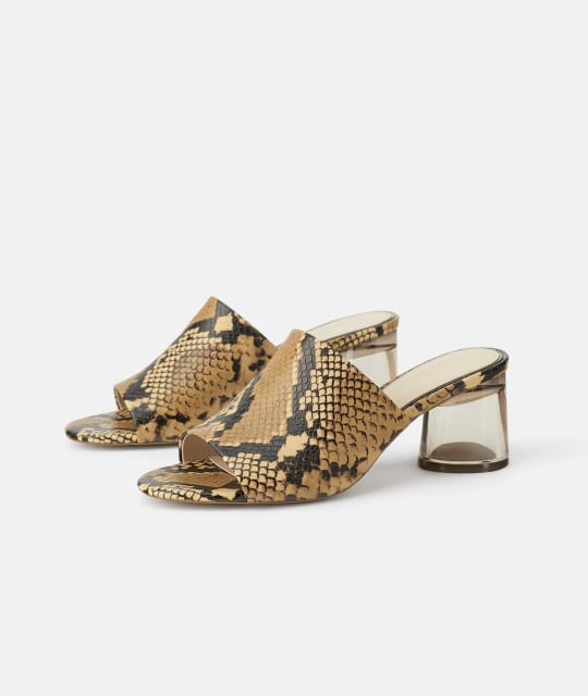
Leather mid-heel Sandals
$129.00
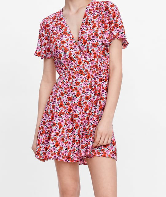
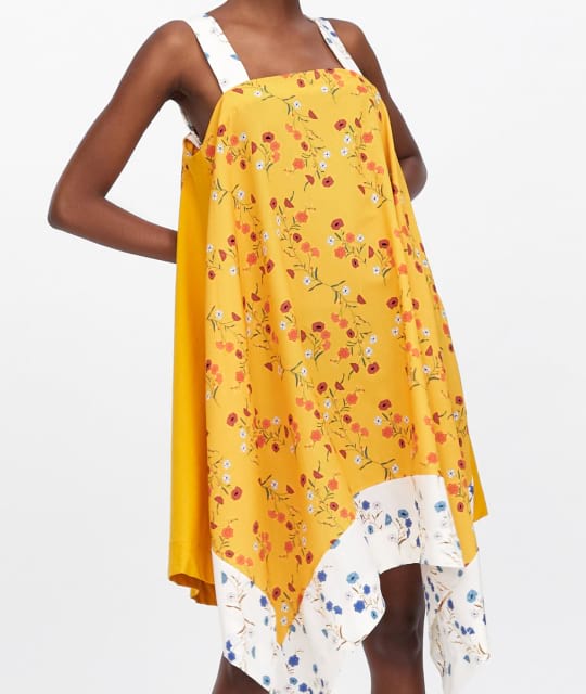
Cotton floral print Dress
$40.00
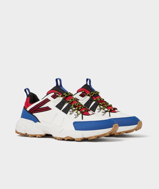
Leather Sneakers
$85.00
Cropped cotton Top
$29.00
Floral print midi Dress
$50.00
Nothing matches your search
😞
Cotton floral print Dress
$40.00
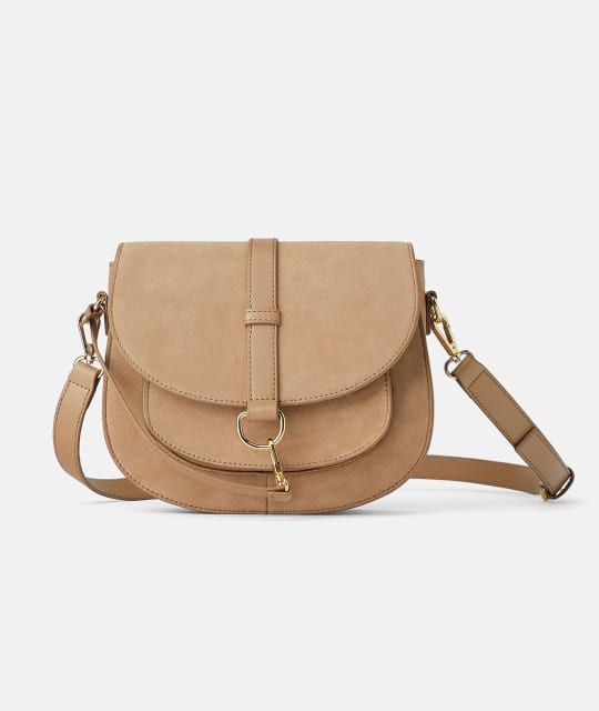
Suede cross body Bag
$49.00
| Size | US | Bust | Waist | Hips |
|---|---|---|---|---|
| XS | 2 | 32 | 24 - 25 | 33 - 34 |
| S | 4 | 34 - 35 | 26 - 27 | 35 - 26 |
| M | 6 | 36 - 37 | 28 - 29 | 38 - 40 |
| L | 8 | 38 - 29 | 30 - 31 | 42 - 44 |
| XL | 10 | 40 - 41 | 32 - 33 | 45 - 47 |
| XXL | 12 | 42 - 43 | 34 - 35 | 48 - 50 |
| Size | US | Foot Length |
|---|---|---|
| 36 | 5 | 22.8 |
| 26.5 | 5.5 | 23.1 |
| 37 | 6 | 23.5 |
| 37.5 | 6. | 23.5 |
| 38 | 7 | 24.1 |
| 38.5 | 7.5 | 24.5 |
| Size | US | Foot Length |
|---|---|---|
| 36 | 5 | 22.8 |
| 39 | 8 | 24.1 |
| 40 | 9 | 25.4 |
| 40.5 | 9.5 | 25.7 |
| 41 | 10 | 26.0 |
Justo ut diam erat hendrerit morbi porttitor, per eu curabitur diam sociis.
Responsive and viewport sizing utilities.
Bootstrap documentation
.w-{25|50|75|100|auto}, .h-{25|50|75|100|auto} - default Bootstrap sizing utilities.
.w-{breakpoint}-{25|50|75|100|auto}, .h-{breakpoint}-{25|50|75|100|auto} - responsive sizing utilites.
.min-w-{25|50|75|100|auto}, .min-h-{25|50|75|100|auto} - sets the minimum width and height to a specified value.
.min-w-{breakpoint}-{25|50|75|100|auto}, .min-h-{breakpoint}-{25|50|75|100|auto} - responsive minimum width and height sizing utilities.
.vw-50 - sets the width to 50% of the viewport width.