Subscribe to Newsletter and get 15% Discount
On your next purchase
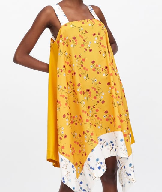
Bootstrap’s cards provide a flexible and extensible content container with multiple variants and options.
Bootstrap documentation

Some quick example text to build on the card title and make up the bulk of the card's content.
Go somewhere
Control the padding of .card-body and .card-footer elements with the following modifiers:
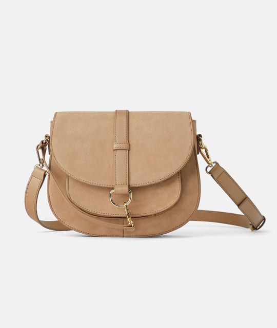
Lorem, ipsum dolor sit amet consectetur adipisicing elit. Excepturi debitis accusamus saepe, inventore quas, dolorem porro, quod iure neque maxime vel amet!
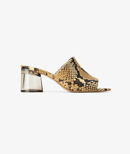
Lorem, ipsum dolor sit amet consectetur adipisicing elit. Excepturi debitis accusamus saepe, inventore quas, dolorem porro, quod iure neque maxime vel amet!
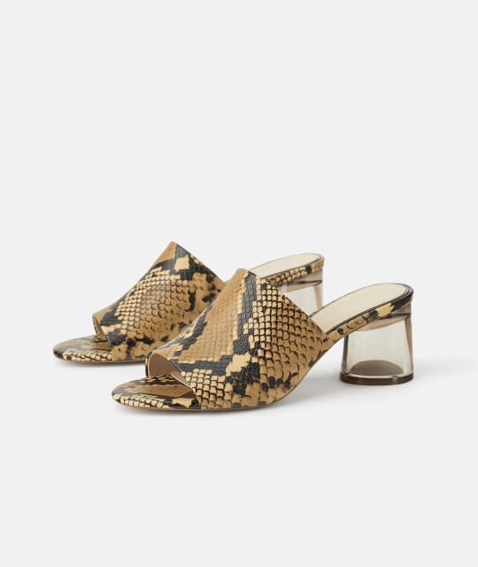
Lorem, ipsum dolor sit amet consectetur adipisicing elit. Excepturi debitis accusamus saepe, inventore quas, dolorem porro, quod iure neque maxime vel amet!
Switch between two images on hover with the following markup:
Add a background image that translates on hover with the following markup:
A circle badge with two sizing and three positioning options.
A standard badge component with two positioning options.
Adds a pricing badge in the top left or right corner of a card.

Card action buttons fading in on hover.

Card action button always visible in the top left or right corner.
Card button visible in the bottom of a card on hover.
Card collapse toggled on hover.